Screens
This document provides the information necessary to generate and use COSMOS Telemetry Screens, which are displayed by the COSMOS Telemetry Viewer application.
Definitions
| Name | Definition |
|---|---|
| Widget | A widget is a graphical element on a COSMOS telemetry screen. It could display text, graph data, provide a button, or perform any other display/user input task. |
| Screen | A screen is a single window that contains any number of widgets which are organized and layed-out in a useful fashion. |
| Screen Definition File | A screen definition file is an ASCII file that tells Telemetry Viewer how to draw a screen. It is made up of a series of keyword/parameter lines that define the telemetry points that are displayed on the screen and how to display them. |
Telemetry Screen Definition Files
Telemetry screen definition files define the the contents of telemetry screens. They take the general form of a SCREEN keyword followed by a series of widget keywords that define the telemetry screen. Screen definition files specific to a particular target go in that target's screens directory. For example: TARGET/screens/version.txt. Screen definition files must be lowercase.
New Widgets
When a telemetry screen definition is parsed and a keyword is encountered that is unrecognized, it is assumed that a file of the form widgetname_widget.rb exists, and contains a class called WidgetnameWidget. Because of this convention, new widgets can be added to the system without any change to the telemetry screen definition format. For more information about creating custom widgets please read the Custom Widgets guide.
Screen API
When writing button scripts in telemetry screens, you have access to the following objects and methods:
api
The api object provides methods for commanding and telemetry operations:
Commanding
| Method | Description |
|---|---|
api.cmd(target_name, command_name, params) | Sends a command with hazardous and range checks. Can also use string syntax: api.cmd("INST COLLECT with TYPE NORMAL") |
api.cmd_no_checks(target_name, command_name, params) | Sends a command without hazardous or range checks |
api.cmd_no_hazardous_check(target_name, command_name, params) | Sends a command without hazardous checks |
api.cmd_no_range_check(target_name, command_name, params) | Sends a command without range checks |
api.cmd_raw(...) | Sends a command without converting parameter values |
api.cmd_raw_no_checks(...) | Sends a raw command without any checks |
api.cmd_raw_no_hazardous_check(...) | Sends a raw command without hazardous checks |
api.cmd_raw_no_range_check(...) | Sends a raw command without range checks |
Telemetry
| Method | Description |
|---|---|
api.tlm(target_name, packet_name, item_name, value_type) | Returns a Promise that resolves with the telemetry value. Can also use string syntax: api.tlm("INST HEALTH_STATUS TEMP1") |
api.get_tlm_packet(target_name, packet_name, value_type, stale_time) | Returns a Promise that resolves with the entire telemetry packet |
Limits
| Method | Description |
|---|---|
api.enable_limits(target, packet, item) | Enables limits checking for an item |
api.disable_limits(target, packet, item) | Disables limits checking for an item |
api.get_out_of_limits() | Returns array of items currently out of limits |
api.get_overall_limits_state(ignored) | Returns the overall limits state |
Utilities
| Method | Description |
|---|---|
api.open_tab(url) | Opens a URL in a new browser tab |
Example using telemetry in a command:
api
  .tlm("INST PARAMS VALUE3", "RAW")
  .then((dur) => api.cmd("INST COLLECT with DURATION " + dur));
screen
The screen object provides methods for interacting with widgets and screens:
| Method | Description |
|---|---|
screen.getNamedWidget(name) | Returns a reference to a named widget (see NAMED_WIDGET) |
screen.open(target, screen) | Opens another telemetry screen |
screen.close(target, screen) | Closes a specific telemetry screen |
screen.closeAll() | Closes all open telemetry screens |
Example using named widgets:
var type = screen.getNamedWidget("COLLECT_TYPE").text();
api.cmd("INST COLLECT with TYPE " + type);
runScript
The runScript function starts a script in Script Runner:
| Syntax | Description |
|---|---|
runScript(scriptName) | Runs the script and opens Script Runner |
runScript(scriptName, false) | Runs the script without opening Script Runner |
runScript(scriptName, true, {ENV_VAR: 'value'}) | Runs the script with environment variables |
Example:
runScript("INST/procedures/collect.rb", true, { TYPE: "NORMAL" });
Screen Keywords
SCREEN
Define a telemetry viewer screen
The SCREEN keyword is the first keyword in any telemetry screen definition. It defines the name of the screen and parameters that affect the screen overall.
| Parameter | Description | Required |
|---|---|---|
| Width | Width in pixels or AUTO to let Telemetry Viewer automatically layout the screen | True |
| Height | Height in pixels or AUTO to let Telemetry Viewer automatically layout the screen | True |
| Polling Period | Number of seconds between screen updates. 0 means disable polling. | True |
Example Usage:
SCREEN AUTO AUTO 1.0
END
Indicates the close of a layout widget
All layout widgets must be closed to properly identify where they stop. For example, a VERTICALBOX keyword must be matched with an END keyword to indicate where the VERTICALBOX ends.
STALE_TIME
Since 5.1.0Values are marked stale if the packet time is more than Stale Time seconds in the past
| Parameter | Description | Required |
|---|---|---|
| value | Items from packets with RECEIVED_TIMESECONDS greater than this value in the past will be marked stale. The default is 30s. Recommend a minimum of 2s to avoid false positives due to race conditions. | True |
Example Usage:
STALE_TIME 5 # Number of seconds to wait before marking data stale
GLOBAL_SETTING
Applies a widget setting to all widgets of a certain type
| Parameter | Description | Required |
|---|---|---|
| Widget Class Name | The name of the class of widgets that this setting will be applied to. For example, LABEL or BUTTON. | True |
| Setting Name | See SETTING for details. | True |
| Setting Value(s) | See SETTING for details. | False |
Example Usage:
GLOBAL_SETTING LABELVALUELIMITSBAR TEXTCOLOR BLACK
GLOBAL_SUBSETTING
Applies a widget subsetting to all widgets of a certain type
Subsettings are only valid for widgets that are made up of more than one subwidget. For example, LABELVALUE is made up of a LABEL at subwidget index 0 and a VALUE at subwidget index 1. This allows for passing settings to specific subwidgets. Some widgets are made up of multiple subwidgets, e.g. LABELVALUELIMITSBAR. To set the Label widget, pass 0 as the Subwidget Index, pass 1 for the Value widget, and 2 for the LimitsBar widget.
| Parameter | Description | Required |
|---|---|---|
| Widget Class Name | The name of the class of widgets that this setting will be applied to. For example, LABELVALUE. | True |
| Subwidget Index | Index to the desired subwidget | True |
| Setting Name | See SETTING for details. | True |
| Setting Value(s) | See SETTING for details. | False |
Example Usage:
# Set all text color to white for labelvaluelimitsbars
GLOBAL_SUBSETTING LABELVALUELIMITSBAR 0 TEXTCOLOR white
SETTING
Applies a widget setting to the previously defined widget
Settings allow for additional tweaks and options to be applied to widgets that are not available in their parameters. These settings are all configured through the SETTING, SUBSETTING, GLOBAL_SETTING and GLOBAL_SUBSETTING keywords. SETTING and SUBSETTING applies only to the widget defined immediately before it. GLOBAL_SETTING and GLOBAL_SUBSETTING applies to all widgets.
Common wiget settings are defined here. Some widgets define their own unique settings which are documented under that specific widget.
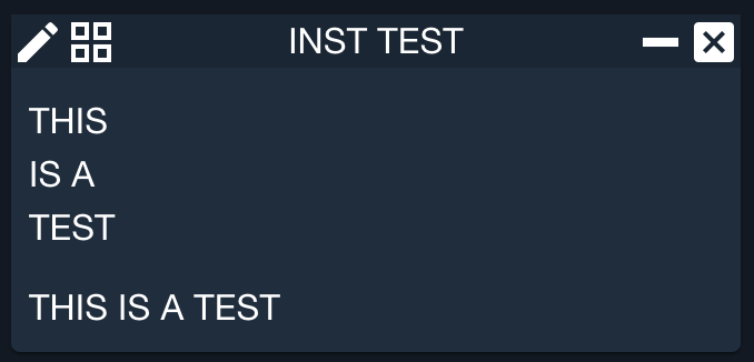
WIDTH
Sets the widget width
WIDTH supports css units with the default (no units) of px (pixels)
| Parameter | Description | Required |
|---|---|---|
| Width | Width in pixels or explicitly declared with units | True |
Example Usage:
LABEL "THIS IS A TEST"
  SETTING WIDTH 50
LABEL "THIS IS A TEST"
  SETTING WIDTH 20em
HEIGHT
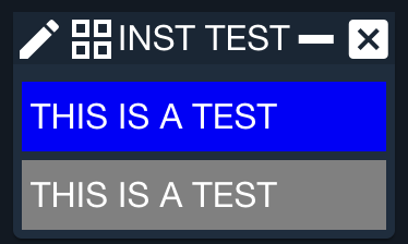
Sets the widget height
HEIGHT supports css units with the default (no units) of px (pixels)
| Parameter | Description | Required |
|---|---|---|
| Height | Height in pixels or explicitly declared with units | True |
Example Usage:
LABEL "THIS IS A TEST"
  SETTING BACKCOLOR BLUE
  SETTING HEIGHT 50
LABEL "THIS IS A TEST"
  SETTING BACKCOLOR GREY
  SETTING HEIGHT 2em
MARGIN
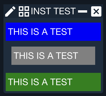
Sets the widget margin
MARGIN supports css units with the default (no units) of px (pixels)
| Parameter | Description | Required |
|---|---|---|
| Size | Size in pixels or explicitly declared with units | True |
Example Usage:
LABEL "THIS IS A TEST"
  SETTING BACKCOLOR BLUE
LABEL "THIS IS A TEST"
  SETTING BACKCOLOR GREY
  SETTING MARGIN 10
LABEL "THIS IS A TEST"
  SETTING BACKCOLOR GREEN
PADDING
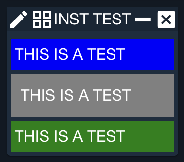
Sets the widget padding
PADDING supports css units with the default (no units) of px (pixels)
| Parameter | Description | Required |
|---|---|---|
| Size | Size in pixels or explicitly declared with units | True |
Example Usage:
LABEL "THIS IS A TEST"
  SETTING BACKCOLOR BLUE
LABEL "THIS IS A TEST"
  SETTING BACKCOLOR GREY
  SETTING PADDING 10
LABEL "THIS IS A TEST"
  SETTING BACKCOLOR GREEN
BACKCOLOR
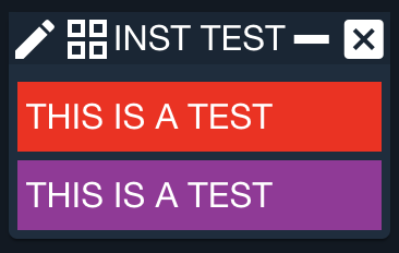
The BACKCOLOR setting sets the background color for a widget
| Parameter | Description | Required |
|---|---|---|
| Color name or Red value | Common name for the color, e.g. 'black', 'red', etc. Alternatively if two more parameters are passed this is the Red value of the RGB value | True |
| Green value | Green value of the RGB value | False |
| Blue value | Blue value of the RGB value | False |
Example Usage:
LABEL "THIS IS A TEST"
  SETTING BACKCOLOR red
LABEL "THIS IS A TEST"
  SETTING BACKCOLOR 155 50 155
TEXTCOLOR
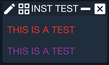
The TEXTCOLOR setting sets the text color for a widget
| Parameter | Description | Required |
|---|---|---|
| Color name or Red value | Common name for the color, e.g. 'black', 'red', etc. Alternatively if two more parameters are passed this is the Red value of the RGB value | True |
| Green value | Green value of the RGB value | False |
| Blue value | Blue value of the RGB value | False |
Example Usage:
LABEL "THIS IS A TEST"
  SETTING TEXTCOLOR red
LABEL "THIS IS A TEST"
  SETTING TEXTCOLOR 155 50 155
BORDERCOLOR
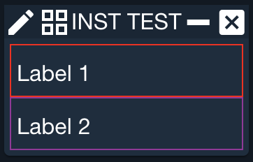
The BORDERCOLOR setting sets the border color for a layout widget
| Parameter | Description | Required |
|---|---|---|
| Color name or Red value | Common name for the color, e.g. 'black', 'red', etc. Alternatively if two more parameters are passed this is the Red value of the RGB value | True |
| Green value | Green value of the RGB value | False |
| Blue value | Blue value of the RGB value | False |
Example Usage:
HORIZONTAL
  LABEL "Label 1"
END
SETTING BORDERCOLOR red
VERTICAL
  LABEL "Label 2"
END
SETTING BORDERCOLOR 155 50 155
RAW
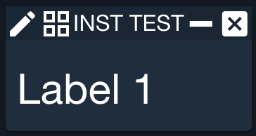
Apply a raw CSS stylesheet key and value
| Parameter | Description | Required |
|---|---|---|
| Key | CSS key like font-size, max-width, etc | True |
| Value | CSS Value | True |
Example Usage:
LABEL "Label 1"
  SETTING RAW font-size 30px
SUBSETTING
Applies a widget subsetting to the previously defined widget
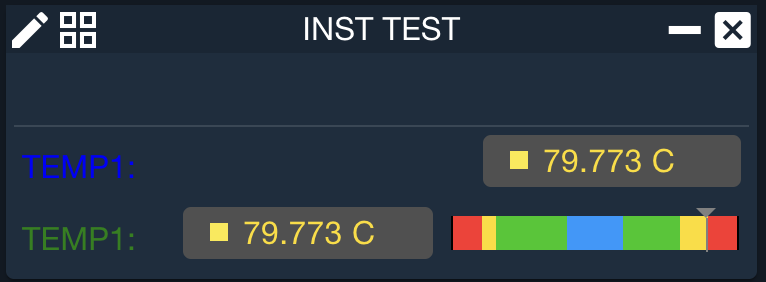
Subsettings are only valid for widgets that are made up of more than one subwidget. For example, LABELVALUE is made up of a LABEL at subwidget index 0 and a VALUE at subwidget index 1. This allows for passing settings to specific subwidgets. Some widgets are made up of multiple subwidgets, e.g. LABELVALUELIMITSBAR. To set the Label widget, pass 0 as the Subwidget Index, pass 1 for the Value widget, and 2 for the LimitsBar widget.
| Parameter | Description | Required |
|---|---|---|
| Subwidget Index | Index to the desired subwidget or 'ALL' to apply the setting to all the subwidgets of this composite widget. | True |
| Setting Name | See SETTING for details. | True |
| Setting Value(s) | See SETTING for details. | False |
Example Usage:
VERTICALBOX
  LABELVALUE INST HEALTH_STATUS TEMP1
    SUBSETTING 0 TEXTCOLOR blue # Change the label's text to blue
  LABELVALUELIMITSBAR INST HEALTH_STATUS TEMP1
    SUBSETTING 0 TEXTCOLOR green # Change the label's text to green
END
TOOLTIP
Since 6.10.3Adds a tooltip to the previously defined widget
TOOLTIP applies a custom hover tooltip to the widget defined immediately before it. This allows you to provide helpful descriptions, mnemonics, or other contextual information that appears when the user hovers over a widget. The tooltip overrides any default tooltip that the widget may have.
| Parameter | Description | Required |
|---|---|---|
| Tooltip Text | The text to display in the tooltip when hovering over the widget. | True |
| Delay | The delay in milliseconds before the tooltip appears (default = 600). | False |
Example Usage:
LED INST PARAMS VALUE5 RAW 25 20
  SETTING LED_COLOR 0 GREEN
  SETTING LED_COLOR 1 RED
  TOOLTIP "Mnemonic: ABCDEF. This is the Star Tracker On/Off Status"
VALUE INST HEALTH_STATUS TEMP1
  TOOLTIP "Temperature sensor 1: Primary thermal control" 1000
NAMED_WIDGET
Name a widget to allow access to it via the getNamedWidget method
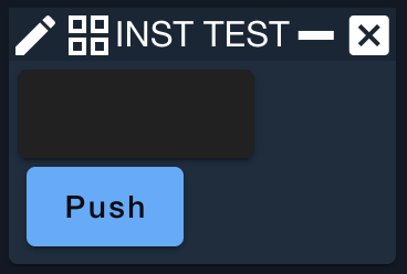
To programmatically access parts of a telemetry screen you need to name the widget. This is useful when creating screens with buttons that read values from other widgets.
getNamedWidget returns the widget itself and thus must be operated on using methods native to that widget
| Parameter | Description | Required |
|---|---|---|
| Widget Name | The unique name applied to the following widget instance. Names must be unique per screen. | True |
| Widget Type | One of the widget types listed in Widget Descriptions | True |
| Widget Parameters | The unique parameters for the given widget type | True |
Example Usage:
NAMED_WIDGET DURATION TEXTFIELD
BUTTON "Push" "screen.getNamedWidget('DURATION').text()"
Layout Widgets
Layout widgets are used to position other widgets on the screen. For example, the HORIZONTAL layout widget places the widgets it encapsulates horizontally on the screen.
VERTICAL
Places the widgets it encapsulates vertically
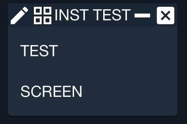
The screen defaults to a vertical layout, so if no layout widgets are specified, all widgets will be automatically placed within a VERTICAL layout widget. The VERTICAL widget sizes itself to fit its contents.
| Parameter | Description | Required |
|---|---|---|
| Margin | Margin between widgets (default = 0px) | False |
Example Usage:
VERTICAL 5px
  LABEL "TEST"
  LABEL "SCREEN"
END
VERTICALBOX
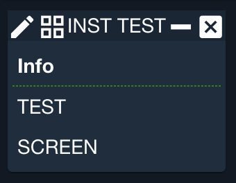
Places the widgets it encapsulates vertically inside a thin border
The VERTICALBOX widget sizes itself to fit its contents vertically and to fit the screen horizontally
| Parameter | Description | Required |
|---|---|---|
| Title | Text to place within the border to label the box | False |
| Margin | Margin between widgets (default = 0px) | False |
Example Usage:
VERTICALBOX Info
  SUBSETTING 1 RAW border "1px dashed green"
  LABEL "TEST"
  LABEL "SCREEN"
END
HORIZONTAL
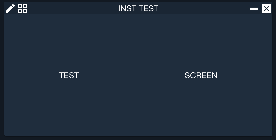
Places the widgets it encapsulates horizontally
The HORIZONTAL widget sizes itself to fit its contents
| Parameter | Description | Required |
|---|---|---|
| Margin | Margin between widgets (default = 0px) | False |
Example Usage:
HORIZONTAL 100
  LABEL "TEST"
  LABEL "SCREEN"
END
HORIZONTALBOX
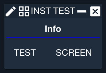
Places the widgets it encapsulates horizontally inside a thin border
The HORIZONTALBOX widget sizes itself to fit its contents
| Parameter | Description | Required |
|---|---|---|
| Title | Text to place within the border to label the box | False |
| Margin | Margin between widgets (default = 0px) | False |
Example Usage:
HORIZONTALBOX Info 10
  SUBSETTING 0 RAW text-align CENTER
  SUBSETTING 1 RAW border "1px solid blue"
  LABEL "TEST"
  LABEL "SCREEN"
END
MATRIXBYCOLUMNS
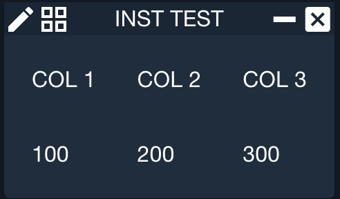
Places the widgets into a table-like matrix
The MATRIXBYCOLUMNS widget sizes itself to fit its contents
| Parameter | Description | Required |
|---|---|---|
| Columns | The number of columns to create | True |
| Margin | Margin between widgets (default = 0px) | False |
Example Usage:
MATRIXBYCOLUMNS 3 10
  LABEL "COL 1"
  LABEL "COL 2"
  LABEL "COL 3"
  LABEL "100"
  LABEL "200"
  LABEL "300"
END
SCROLLWINDOW
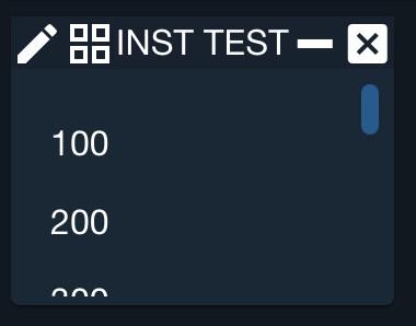
Places the widgets inside of it into a scrollable area
The SCROLLWINDOW widget sizes itself to fit the screen in which it is contained
| Parameter | Description | Required |
|---|---|---|
| Height | Maximum height of the scroll window in pixels (default = 200) | False |
| Margin | Margin between widgets (default = 0px) | False |
Example Usage:
SCROLLWINDOW 100 10
  VERTICAL
    LABEL "100"
    LABEL "200"
    LABEL "300"
    LABEL "400"
    LABEL "500"
    LABEL "600"
    LABEL "700"
    LABEL "800"
    LABEL "900"
  END
END
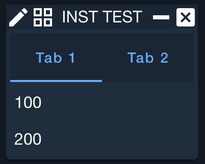
TABBOOK
Creates a tabbed area in which to place TABITEM widgets
TABITEM
Creates a VERTICAL layout tab into which to place widgets
| Parameter | Description | Required |
|---|---|---|
| Tab text | Text to display in the tab | True |
Example Usage:
TABBOOK
  TABITEM "Tab 1"
    LABEL "100"
    LABEL "200"
  END
  TABITEM "Tab 2"
    LABEL "300"
    LABEL "400"
  END
END
IFRAME
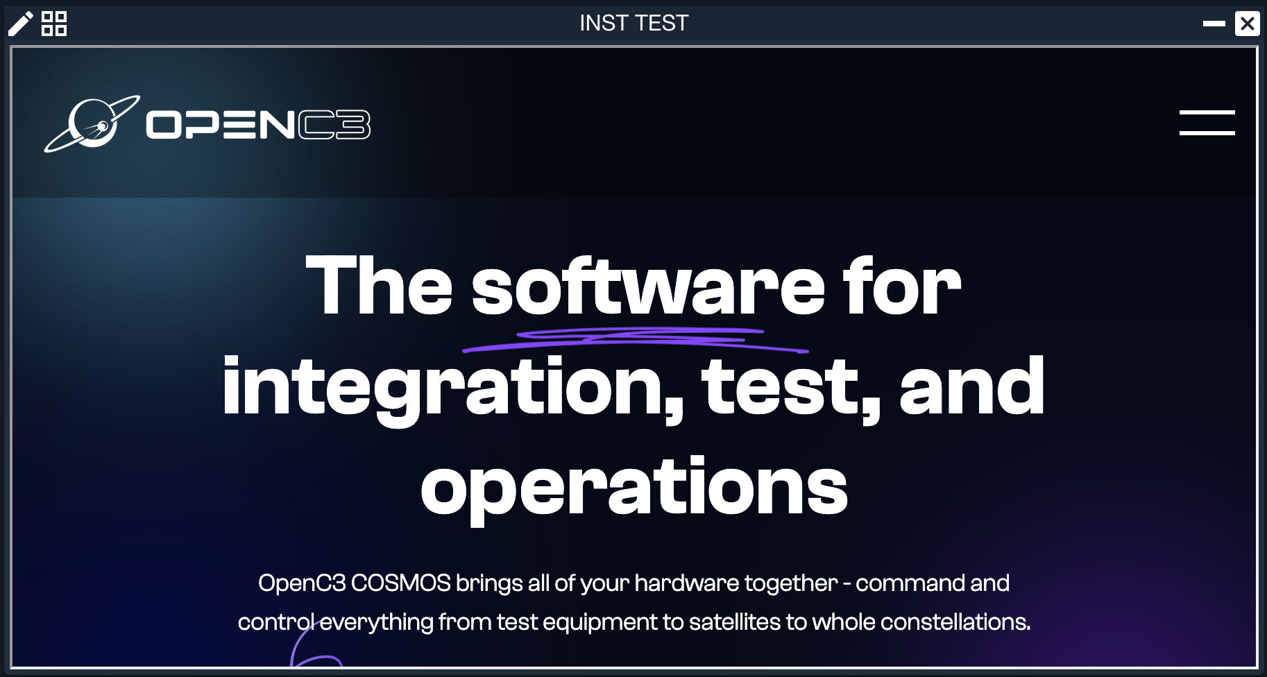
Open external tools in an Iframe within OpenC3
| Parameter | Description | Required |
|---|---|---|
| URL | The path to the page to display in the iframe | True |
| Width | Width of the widget | False |
| Height | Height of the widget | False |
Example Usage:
IFRAME https://openc3.com 900 450
Decoration Widgets
Decoration widgets are used to enhance the appearance of the screen. They do not respond to input, nor does the output vary with telemetry.
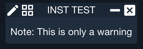
LABEL
Displays text on the screen
Generally, label widgets contain a telemetry mnemonic and are placed next to the telemetry VALUE widget.
| Parameter | Description | Required |
|---|---|---|
| Text | Text to display on the label | True |
Example Usage:
LABEL "Note: This is only a warning"
HORIZONTALLINE
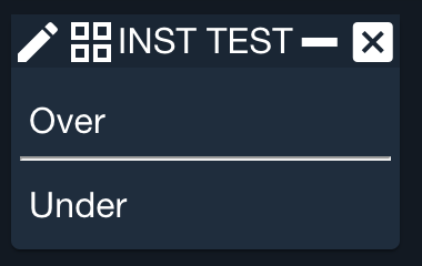
Since 5.5.1Displays a horizontal line on the screen that can be used as a separator
Example Usage:
LABEL Over
HORIZONTALLINE
LABEL Under
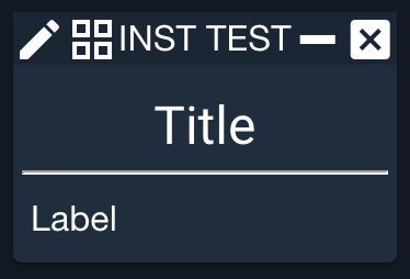
TITLE
Displays a large centered title on the screen
| Parameter | Description | Required |
|---|---|---|
| Text | Text to display | True |
Example Usage:
TITLE "Title"
HORIZONTALLINE
LABEL "Label"
SPACER
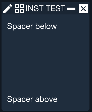
Places a fixed size spacer in between widgets
| Parameter | Description | Required |
|---|---|---|
| Width | Width of the spacer in pixels | True |
| Height | Height of the spacer in pixels | True |
Example Usage:
VERTICAL 3
  LABEL "Spacer below"
  SPACER 0 100
  LABEL "Spacer above"
END
FILEDISPLAY
Since 6.10.3Displays the contents of a target file with syntax highlighting
| Parameter | Description | Required |
|---|---|---|
| File path | Path to the file relative to the target folder (e.g. "INST/procedures/file.rb") | True |
| Width | Width of the widget in pixels (default = 600) | False |
| Height | Height of the widget in pixels (default = 300) | False |
Example Usage:
FILEDISPLAY "INST/data/sample.json" 400 200
FILECHECKSUM
Since 6.10.3Displays SHA-256 checksum of one or more files, with comparison if multiple
| Parameter | Description | Required |
|---|---|---|
| File path | Path to a file relative to the target folder (e.g. "INST/procedures/file.rb"). Multiple file paths can be provided to compare checksums. | True |
Example Usage:
FILECHECKSUM "INST/data/sample.json"
FILECHECKSUM "INST/data/sample.json" "INST2/data/sample.json"
FILECHECKSUM "INST/data/file1.bin" "INST/data/file2.bin" "INST/data/file3.bin"
Telemetry Widgets
Telemetry widgets are used to display telemetry values. The first parameters to each of these widgets is a telemetry mnemonic. Depending on the type and purpose of the telemetry item, the screen designer may select from a wide selection of widgets to display the value in the most useful format.
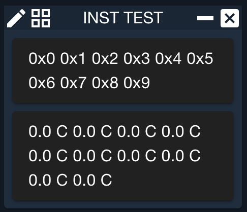
ARRAY
Displays ARRAY data organized into rows and space separated
| Parameter | Description | Required |
|---|---|---|
| Target name | The target name | True |
| Packet name | The packet name | True |
| Item name | The item name | True |
| Width | Width of the widget (default = 200) | False |
| Height | Height of the widget (default = 100) | False |
| Format string | Format string applied to each array item (default = nil) | False |
| Items per row | Number of array items per row (default = 4) | False |
| Value type | The type of the value to display. Default is CONVERTED. Valid Values: RAW, CONVERTED, FORMATTED | False |
Example Usage:
ARRAY INST HEALTH_STATUS ARY 250 80 "0x%x" 6 FORMATTED
ARRAY INST HEALTH_STATUS ARY2 200 100 nil 4 FORMATTED
ARRAYPLOT
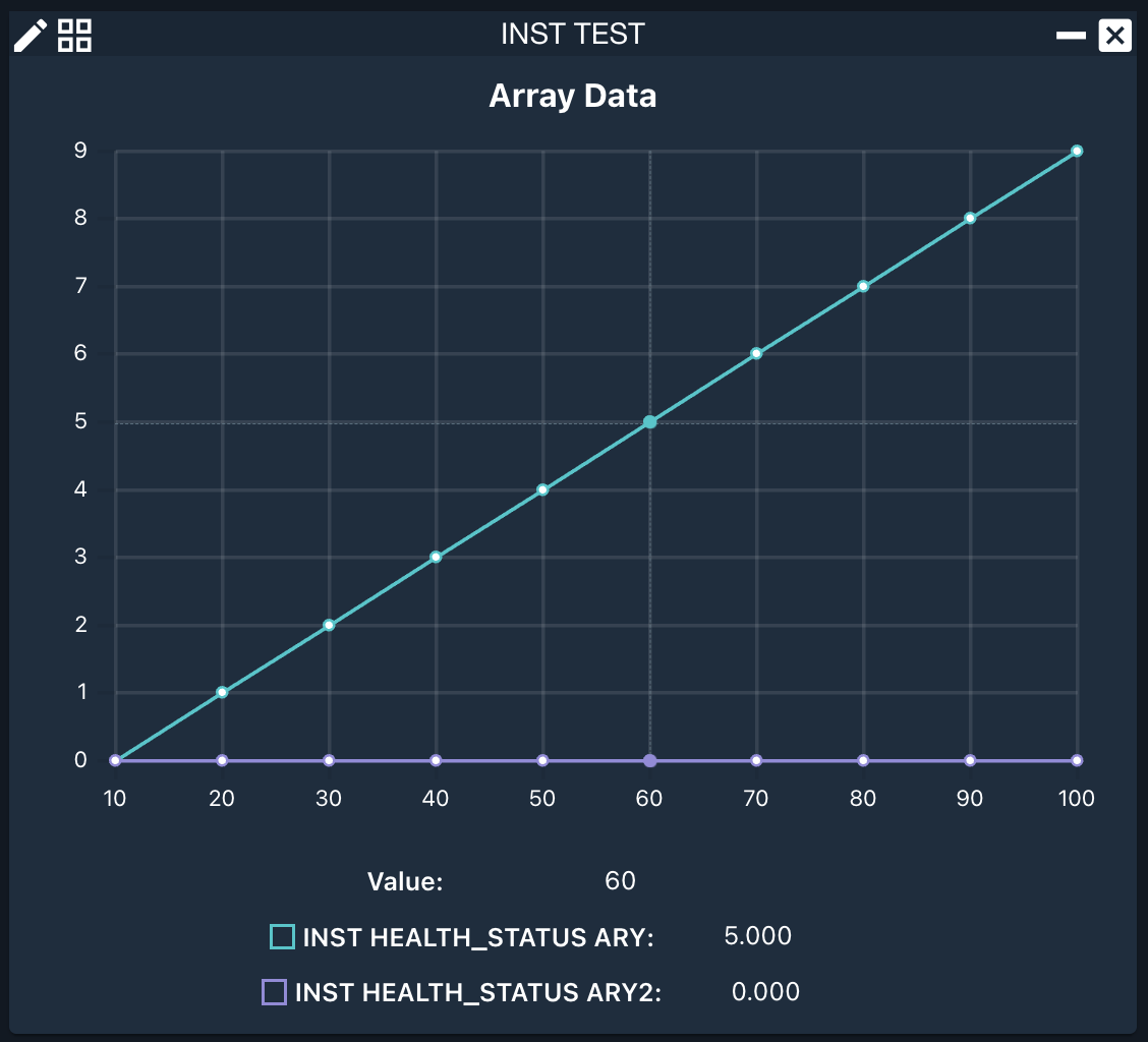
Plot an array of values.
The item can either be a simple array or a 2D array of x values and y values, e.g. [[x1, x2, x3], [y1, y2, y3]]. If the X_AXIS setting is not specified, the X axis starts with 0 and increments by 1. If the X_AXIS setting is used the x values of a 2D array will be ignored.
Example Usage:
ARRAYPLOT
  SETTING TITLE "Array Data"
  SETTING ITEM INST HEALTH_STATUS ARY
  SETTING ITEM INST HEALTH_STATUS ARY2
  SETTING SIZE 600 400
  SETTING X_AXIS 10 10
The following settings apply to ARRAYPLOT. They are applied using the SETTING keyword.
TITLE
Title of the plot
| Parameter | Description | Required |
|---|---|---|
| Title | Title of the plot | True |
X_AXIS
Define the x-axis parameters for the plot
| Parameter | Description | Required |
|---|---|---|
| Start | Start value for the x-axis | True |
| Step | Step value for the x-axis | True |
ITEM
Add a telemetry item to the graph
| Parameter | Description | Required |
|---|---|---|
| Target Name | The target name | True |
| Packet Name | The packet name | True |
| Item Name | The item name | True |
| Value Type | The type of the value to display. Default is CONVERTED. Valid Values: RAW, CONVERTED | False |
| Reduced | Whether to display reduced data. Default is DECOM. Valid Values: DECOM, REDUCED_MINUTE, REDUCED_HOUR, REDUCED_DAY | False |
| Reduced Type | The type of reduce data to display. Only applies if Reduced is not DECOM. Valid Values: MIN, MAX, AVG, STDDEV | False |
STARTTIME
Since 5.5.1Start the graph history at the designated Time
| Parameter | Description | Required |
|---|---|---|
| Start Time | Start time as formatted 'YYYY/MM/DD HH:MM:SS' | True |
HISTORY
Since 5.5.1Display an initial history of data
| Parameter | Description | Required |
|---|---|---|
| Value | Value(d,h,m,s). For example 1d, 2h, 30m, 15s | True |
SECONDSGRAPHED
Display the specified number of seconds in the graph
| Parameter | Description | Required |
|---|---|---|
| Time | Number of seconds to display | True |
POINTSSAVED
Save the number of seconds in graph memory
| Parameter | Description | Required |
|---|---|---|
| Time | Number of seconds to save | True |
POINTSGRAPHED
Number of points to display on the graph
| Parameter | Description | Required |
|---|---|---|
| Time | Number of points to graph | True |
SIZE
Size of the graph
| Parameter | Description | Required |
|---|---|---|
| Width | Width in pixels | True |
| Height | Height in pixels | True |
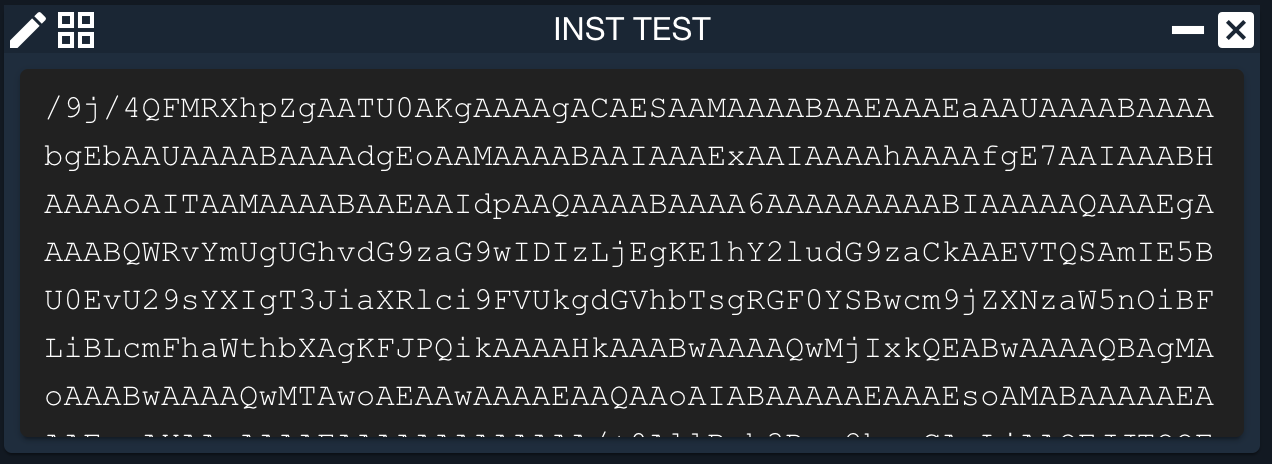
BLOCK
Displays BLOCK data organized into rows and space separated
| Parameter | Description | Required |
|---|---|---|
| Target name | The target name | True |
| Packet name | The packet name | True |
| Item name | The item name | True |
| Width | Width of the widget (default = 200) | False |
| Height | Height of the widget (default = 100) | False |
| Format string | Format string applied to each array item (default = nil) | False |
| Bytes per word | Number of bytes per word (default = 4) | False |
| Words per row | Number of words per row (default = 4 | False |
| Address format | Format for the address printed at the beginning of each line (default = nil which means do not print an address) | False |
| Value type | The type of the value to display. Default is CONVERTED. Valid Values: RAW, CONVERTED, FORMATTED | False |
Example Usage:
BLOCK INST IMAGE IMAGE 620 200 "%02X" 4 4 "0x%08X:"
FORMATVALUE
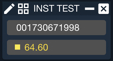
Displays a box with a formatted value
Data is formatted by the specified string rather than by a format string given in the telemetry definition files. The white portion of the box darkens to gray while the value remains stagnant, then brightens to white each time the value changes. Additionally the value is colored based on the items limits state (Red for example if it is out of limits).
| Parameter | Description | Required |
|---|---|---|
| Target name | The target name | True |
| Packet name | The packet name | True |
| Item name | The item name | True |
| Format string | Printf style format string to apply to the telemetry item | False |
| Value type | The type of the value to display. Default is CONVERTED. Valid Values: RAW, CONVERTED, FORMATTED | False |
| Number of characters | The number of characters wide to make the value box (default = 12) | False |
Example Usage:
FORMATVALUE INST LATEST TIMESEC %012u CONVERTED 20
FORMATVALUE INST LATEST TEMP1 %.2f CONVERTED 20
LABELLED
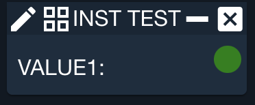
Displays a LABEL followed by a LED
See the LED widget for more information
| Parameter | Description | Required |
|---|---|---|
| Target name | The target name | True |
| Packet name | The packet name | True |
| Item name | The item name | True |
| Value type | The type of the value to display. Default is CONVERTED. Valid Values: RAW, CONVERTED, FORMATTED | False |
| Width | Width of the LED circle (default = 15) | False |
| Height | Height of the LED circle (default = 15) | False |
| Justification | How to justify the label and LED together. The default of 'SPLIT' aligns the label to the left and the LED to the right with any additional space going between them. 'CENTER' pushes the label and LED together with any additional space to the left and right. 'LEFT' or 'RIGHT' pushes them to the respective side with the space going on the opposite. Valid Values: SPLIT, CENTER, LEFT, RIGHT | False |
Example Usage:
LABELLED INST PARAMS VALUE1
  SETTING LED_COLOR GOOD GREEN
  SETTING LED_COLOR BAD RED
The following settings apply to LABELLED. They are applied using the SETTING keyword.
LED_COLOR
Map a state or value to a color
| Parameter | Description | Required |
|---|---|---|
| Value | State or value. ANY used to match any value or state not declared. | True |
| LED color | Color of the LED | True |
LABELPROGRESSBAR
Displays a LABEL with the item name followed by a PROGRESSBAR
| Parameter | Description | Required |
|---|---|---|
| Target name | The target name | True |
| Packet name | The packet name | True |
| Item name | The item name | True |
| Scale factor | Value to multiply the telemetry item by before displaying in the progress bar. Final value should be in the range of 0 to 100. Default is 1.0. | False |
| Width | Width of the progress bar (default = 80 pixels | False |
| Value type | The type of the value to display. Default is CONVERTED. Valid Values: RAW, CONVERTED, FORMATTED | False |
Example Usage:
LABELPROGRESSBAR INST ADCS POSPROGRESS 2 200 RAW
LABELPROGRESSBAR INST ADCS POSPROGRESS

LABELVALUE
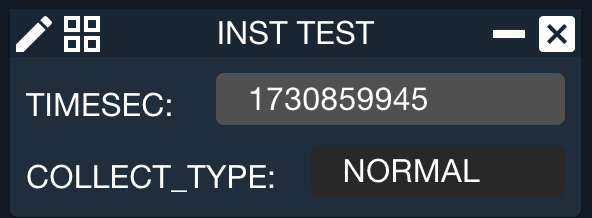
Displays a LABEL with the item name followed by a VALUE
| Parameter | Description | Required |
|---|---|---|
| Target name | The target name | True |
| Packet name | The packet name | True |
| Item name | The item name | True |
| Value type | The type of the value to display. Default is CONVERTED. Valid Values: RAW, CONVERTED, FORMATTED | False |
| Number of characters | The number of characters wide to make the value box (default = 12) | False |
Example Usage:
LABELVALUE INST LATEST TIMESEC CONVERTED 18
LABELVALUE INST LATEST COLLECT_TYPE
LABELVALUEDESC
Displays a LABEL with the items description followed by a VALUE
| Parameter | Description | Required |
|---|---|---|
| Target name | The target name | True |
| Packet name | The packet name | True |
| Item name | The item name | True |
| Description | The description to display in the label (default is to display the description text associated with the telemetry item) | False |
| Value type | The type of the value to display. Default is CONVERTED. Valid Values: RAW, CONVERTED, FORMATTED | False |
| Number of characters | The number of characters wide to make the value box (default = 12) | False |
Example Usage:
LABELVALUEDESC INST HEALTH_STATUS TEMP1 "Temperature number 1" RAW 18
LABELVALUEDESC INST HEALTH_STATUS COLLECT_TYPE

LABELVALUELIMITSBAR
Displays a LABEL with the item name followed by VALUE and LIMITSBAR widgets
| Parameter | Description | Required |
|---|---|---|
| Target name | The target name | True |
| Packet name | The packet name | True |
| Item name | The item name | True |
| Value type | The type of the value to display. Default is CONVERTED. Valid Values: RAW, CONVERTED, FORMATTED | False |
| Number of characters | The number of characters wide to make the value box (default = 12) | False |
LABELVALUELIMITSCOLUMN
Displays a LABEL with the item name followed by VALUE and LIMITSCOLUMN widgets
| Parameter | Description | Required |
|---|---|---|
| Target name | The target name | True |
| Packet name | The packet name | True |
| Item name | The item name | True |
| Value type | The type of the value to display. Default is CONVERTED. Valid Values: RAW, CONVERTED, FORMATTED | False |
| Number of characters | The number of characters wide to make the value box (default = 12) | False |
Example Usage:
LABELVALUELIMITSCOLUMN INST HEALTH_STATUS TEMP1 CONVERTED 18
LABELVALUELIMITSCOLUMN INST HEALTH_STATUS TEMP1
LABELVALUERANGEBAR
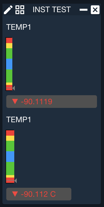
Displays a LABEL with the item name followed by VALUE and RANGEBAR widgets
| Parameter | Description | Required |
|---|---|---|
| Target name | The target name | True |
| Packet name | The packet name | True |
| Item name | The item name | True |
| Low Value | Minimum value to display on the range bar. If the telemetry item goes below this value the bar is “pegged” on the low end. | True |
| High Value | Maximum value to display on the range bar. If the telemetry item goes above this value the bar is “pegged” on the high end. | True |
| Value type | The type of the value to display. Default is CONVERTED. Valid Values: RAW, CONVERTED, FORMATTED | False |
| Number of characters | The number of characters wide to make the value box (default = 12) | False |
| Width | Width of the range bar (default = 160) | False |
| Height | Height of the range bar (default = 25) | False |
Example Usage:
LABELVALUERANGEBAR INST HEALTH_STATUS TEMP1 0 100000 RAW 18 200 40
LABELVALUERANGEBAR INST HEALTH_STATUS TEMP1 -120 120

LED
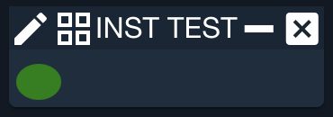
Displays a LED which changes color based on telemetry values
By default TRUE is green and FALSE is red and all other values are black. Additional values can be added by using the LED_COLOR setting. For example LED INST PARAMS VALUE3 RAW can be followed by SETTING LED_COLOR 0 GREEN, SETTING LED_COLOR 1 RED, and SETTING LED_COLOR ANY ORANGE. See LIMITSCOLOR for a widget that displays a circle depicting the limits color of an item.
| Parameter | Description | Required |
|---|---|---|
| Target name | The target name | True |
| Packet name | The packet name | True |
| Item name | The item name | True |
| Value type | The type of the value to display. Default is CONVERTED. Valid Values: RAW, CONVERTED, FORMATTED | False |
| Width | Width of the LED circle (default = 20) | False |
| Height | Height of the LED circle (default = 20) | False |
Example Usage:
LED INST PARAMS VALUE5 RAW 25 20 # Ellipse
  SETTING LED_COLOR 0 GREEN
  SETTING LED_COLOR 1 RED
  SETTING LED_COLOR ANY YELLOW
The following settings apply to LED. They are applied using the SETTING keyword.
LED_COLOR
Map a state or value to a color
| Parameter | Description | Required |
|---|---|---|
| Value | State or value. ANY used to match any value or state not declared. | True |
| LED color | Color of the LED | True |
LIMITSBAR
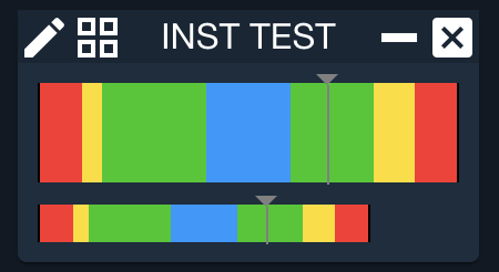
Displays an item's current value within its colored limits horizontally
| Parameter | Description | Required |
|---|---|---|
| Target name | The target name | True |
| Packet name | The packet name | True |
| Item name | The item name | True |
| Value type | The type of the value to display. Default is CONVERTED. Valid Values: RAW, CONVERTED, FORMATTED | False |
| Width | Width of the range bar (default = 160) | False |
| Height | Height of the range bar (default = 25) | False |
Example Usage:
LIMITSBAR INST HEALTH_STATUS TEMP1 CONVERTED 200 50
LIMITSBAR INST HEALTH_STATUS TEMP1
LIMITSCOLUMN
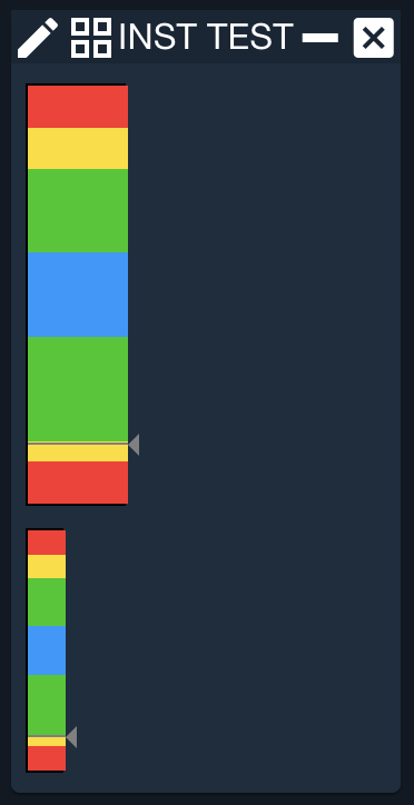
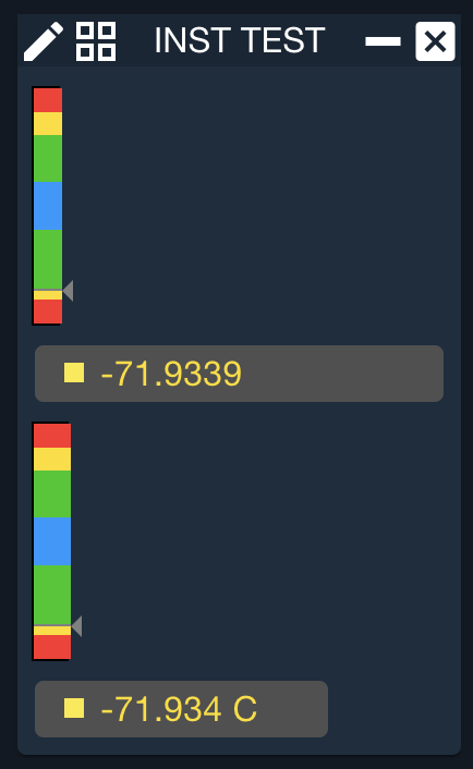
Displays an item's current value within its colored limits vertically
| Parameter | Description | Required |
|---|---|---|
| Target name | The target name | True |
| Packet name | The packet name | True |
| Item name | The item name | True |
| Value type | The type of the value to display. Default is CONVERTED. Valid Values: RAW, CONVERTED, FORMATTED | False |
| Width | Width of the range bar (default = 160) | False |
| Height | Height of the range bar (default = 25) | False |
Example Usage:
LIMITSCOLUMN INST HEALTH_STATUS TEMP1 CONVERTED 50 200
LIMITSCOLUMN INST HEALTH_STATUS TEMP1
LIMITSCOLOR
Displays a circle depicting the limits color of an item. See LED for a widget that displays a circle which changes to an arbitrary color based on telemetry values.
| Parameter | Description | Required |
|---|---|---|
| Target name | The target name | True |
| Packet name | The packet name | True |
| Item name | The item name | True |
| Value type | The type of the value to display. Default is CONVERTED. Valid Values: RAW, CONVERTED, FORMATTED | False |
| Radius | Radius of the circle (default is 10) | False |
| Item Name Display | Show the full item name, e.g. TGT PKT ITEM (true), no item name (nil or none) or just the item name (false). Default is false. | False |
Example Usage:
HORIZONTAL
  LIMITSCOLOR INST HEALTH_STATUS TEMP1 CONVERTED 10 NIL # No label
  LABEL '1st Temp'
END
LIMITSCOLOR INST HEALTH_STATUS TEMP2 # Default is label with just item name
LIMITSCOLOR INST HEALTH_STATUS TEMP3 CONVERTED 20 TRUE # Full TGT/PKT/ITEM label
LIMITSCOLOR INST HEALTH_STATUS TEMP4
  SETTING ASTRO TRUE
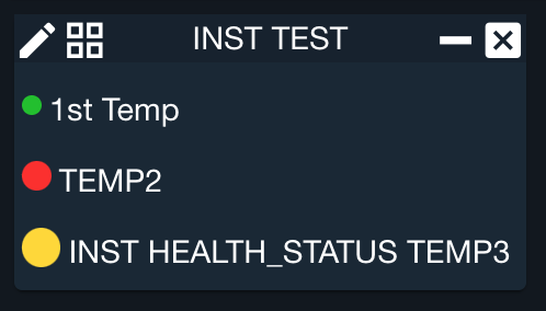
The following settings apply to LIMITSCOLOR. They are applied using the SETTING keyword.
ASTRO
Display Astro status icons instead of a colored circle
When set, the LIMITSCOLOR renders an Astro (rux-status) icon whose shape reflects the severity level, improving accessibility for colorblind users. Limits colors are automatically mapped to Astro statuses (GREEN to normal, RED to critical, YELLOW to caution, BLUE to standby).
VALUELIMITSBAR
Displays an item VALUE followed by LIMITSBAR
| Parameter | Description | Required |
|---|---|---|
| Target name | The target name | True |
| Packet name | The packet name | True |
| Item name | The item name | True |
| Value type | The type of the value to display. Default is CONVERTED. Valid Values: RAW, CONVERTED, FORMATTED | False |
| Number of characters | The number of characters wide to make the value box (default = 12) | False |
Example Usage:
VALUELIMITSBAR INST HEALTH_STATUS TEMP1 CONVERTED 18
VALUELIMITSBAR INST HEALTH_STATUS TEMP1

VALUELIMITSCOLUMN
Displays an item VALUE followed by LIMITSCOLUMN
| Parameter | Description | Required |
|---|---|---|
| Target name | The target name | True |
| Packet name | The packet name | True |
| Item name | The item name | True |
| Value type | The type of the value to display. Default is CONVERTED. Valid Values: RAW, CONVERTED, FORMATTED | False |
| Number of characters | The number of characters wide to make the value box (default = 8) | False |
Example Usage:
VALUELIMITSCOLUMN INST HEALTH_STATUS TEMP1 CONVERTED 18
VALUELIMITSCOLUMN INST HEALTH_STATUS TEMP1
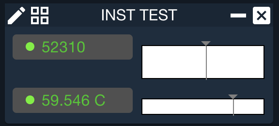
VALUERANGEBAR
Displays an item VALUE followed by RANGEBAR
| Parameter | Description | Required |
|---|---|---|
| Target name | The target name | True |
| Packet name | The packet name | True |
| Item name | The item name | True |
| Low Value | Minimum value to display on the range bar. If the telemetry item goes below this value the bar is “pegged” on the low end. | True |
| High Value | Maximum value to display on the range bar. If the telemetry item goes above this value the bar is “pegged” on the high end. | True |
| Value type | The type of the value to display. Default is CONVERTED. Valid Values: RAW, CONVERTED, FORMATTED | False |
| Number of characters | The number of characters wide to make the value box (default = 12) | False |
| Width | Width of the range bar (default = 160) | False |
| Height | Height of the range bar (default = 25) | False |
Example Usage:
VALUERANGEBAR INST HEALTH_STATUS TEMP1 0 100000 RAW 18 200 40
VALUERANGEBAR INST HEALTH_STATUS TEMP1 -120 120
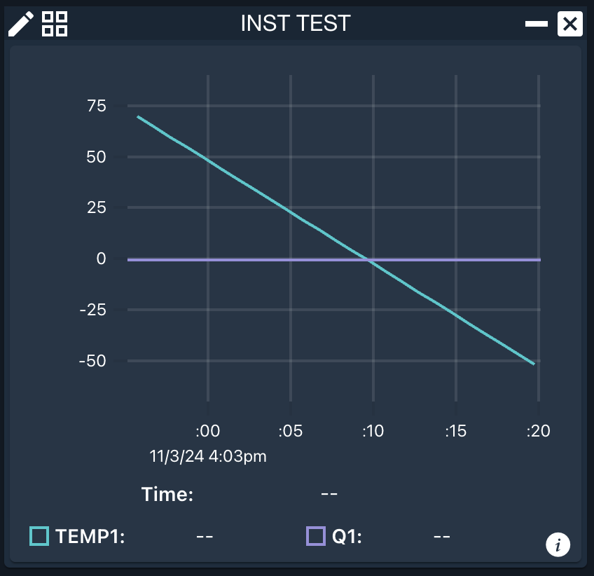
LINEGRAPH
Displays a line graph of a telemetry item
| Parameter | Description | Required |
|---|---|---|
| Target Name | The target name | True |
| Packet Name | The packet name | True |
| Item Name | The item name | True |
| Value Type | The type of the value to display. Default is CONVERTED. Valid Values: RAW, CONVERTED | False |
| Reduced | Whether to display reduced data. Default is DECOM. Valid Values: DECOM, REDUCED_MINUTE, REDUCED_HOUR, REDUCED_DAY | False |
| Reduced Type | The type of reduce data to display. Only applies if Reduced is not DECOM. Valid Values: MIN, MAX, AVG, STDDEV | False |
Example Usage:
LINEGRAPH INST HEALTH_STATUS TEMP1
  SETTING ITEM INST ADCS Q1 # Add additional item to graph
The following settings apply to LINEGRAPH. They are applied using the SETTING keyword.
ITEM
Add a telemetry item to the graph
| Parameter | Description | Required |
|---|---|---|
| Target Name | The target name | True |
| Packet Name | The packet name | True |
| Item Name | The item name | True |
| Value Type | The type of the value to display. Default is CONVERTED. Valid Values: RAW, CONVERTED | False |
| Reduced | Whether to display reduced data. Default is DECOM. Valid Values: DECOM, REDUCED_MINUTE, REDUCED_HOUR, REDUCED_DAY | False |
| Reduced Type | The type of reduce data to display. Only applies if Reduced is not DECOM. Valid Values: MIN, MAX, AVG, STDDEV | False |
STARTTIME
Since 5.5.1Start the graph history at the designated Time
| Parameter | Description | Required |
|---|---|---|
| Start Time | Start time as formatted 'YYYY/MM/DD HH:MM:SS' | True |
HISTORY
Since 5.5.1Display an initial history of data
| Parameter | Description | Required |
|---|---|---|
| Value | Value(d,h,m,s). For example 1d, 2h, 30m, 15s | True |
SECONDSGRAPHED
Display the specified number of seconds in the graph
| Parameter | Description | Required |
|---|---|---|
| Time | Number of seconds to display | True |
POINTSSAVED
Save the number of seconds in graph memory
| Parameter | Description | Required |
|---|---|---|
| Time | Number of seconds to save | True |
POINTSGRAPHED
Number of points to display on the graph
| Parameter | Description | Required |
|---|---|---|
| Time | Number of points to graph | True |
SIZE
Size of the graph
| Parameter | Description | Required |
|---|---|---|
| Width | Width in pixels | True |
| Height | Height in pixels | True |
SPARKLINE
Displays a sparkline graph (no cursor, scale or legend) of a telemetry item
| Parameter | Description | Required |
|---|---|---|
| Target Name | The target name | True |
| Packet Name | The packet name | True |
| Item Name | The item name | True |
| Value Type | The type of the value to display. Default is CONVERTED. Valid Values: RAW, CONVERTED | False |
| Reduced | Whether to display reduced data. Default is DECOM. Valid Values: DECOM, REDUCED_MINUTE, REDUCED_HOUR, REDUCED_DAY | False |
| Reduced Type | The type of reduce data to display. Only applies if Reduced is not DECOM. Valid Values: MIN, MAX, AVG, STDDEV | False |
Example Usage:
SPARKLINE INST HEALTH_STATUS TEMP1
  SETTING SIZE 400 50
  SETTING HISTORY 30s # Add 30 seconds of data into graph

The following settings apply to SPARKLINE. They are applied using the SETTING keyword.
ITEM
Add a telemetry item to the graph
| Parameter | Description | Required |
|---|---|---|
| Target Name | The target name | True |
| Packet Name | The packet name | True |
| Item Name | The item name | True |
| Value Type | The type of the value to display. Default is CONVERTED. Valid Values: RAW, CONVERTED | False |
| Reduced | Whether to display reduced data. Default is DECOM. Valid Values: DECOM, REDUCED_MINUTE, REDUCED_HOUR, REDUCED_DAY | False |
| Reduced Type | The type of reduce data to display. Only applies if Reduced is not DECOM. Valid Values: MIN, MAX, AVG, STDDEV | False |
STARTTIME
Since 5.5.1Start the graph history at the designated Time
| Parameter | Description | Required |
|---|---|---|
| Start Time | Start time as formatted 'YYYY/MM/DD HH:MM:SS' | True |
HISTORY
Since 5.5.1Display an initial history of data
| Parameter | Description | Required |
|---|---|---|
| Value | Value(d,h,m,s). For example 1d, 2h, 30m, 15s | True |
SECONDSGRAPHED
Display the specified number of seconds in the graph
| Parameter | Description | Required |
|---|---|---|
| Time | Number of seconds to display | True |
POINTSSAVED
Save the number of seconds in graph memory
| Parameter | Description | Required |
|---|---|---|
| Time | Number of seconds to save | True |
POINTSGRAPHED
Number of points to display on the graph
| Parameter | Description | Required |
|---|---|---|
| Time | Number of points to graph | True |
SIZE
Size of the graph
| Parameter | Description | Required |
|---|---|---|
| Width | Width in pixels | True |
| Height | Height in pixels | True |
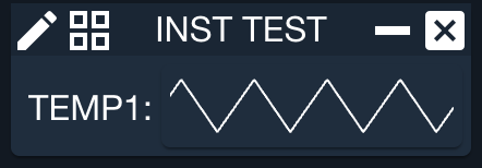
LABELSPARKLINE
Displays a LABEL with the item name followed by a SPARKLINE
| Parameter | Description | Required |
|---|---|---|
| Target Name | The target name | True |
| Packet Name | The packet name | True |
| Item Name | The item name | True |
| Value Type | The type of the value to display. Default is CONVERTED. Valid Values: RAW, CONVERTED | False |
| Reduced | Whether to display reduced data. Default is DECOM. Valid Values: DECOM, REDUCED_MINUTE, REDUCED_HOUR, REDUCED_DAY | False |
| Reduced Type | The type of reduce data to display. Only applies if Reduced is not DECOM. Valid Values: MIN, MAX, AVG, STDDEV | False |
Example Usage:
LABELSPARKLINE INST HEALTH_STATUS TEMP1
  SETTING HISTORY 5m # Add 5 minutes of data into graph
The following settings apply to LABELSPARKLINE. They are applied using the SETTING keyword.
ITEM
Add a telemetry item to the graph
| Parameter | Description | Required |
|---|---|---|
| Target Name | The target name | True |
| Packet Name | The packet name | True |
| Item Name | The item name | True |
| Value Type | The type of the value to display. Default is CONVERTED. Valid Values: RAW, CONVERTED | False |
| Reduced | Whether to display reduced data. Default is DECOM. Valid Values: DECOM, REDUCED_MINUTE, REDUCED_HOUR, REDUCED_DAY | False |
| Reduced Type | The type of reduce data to display. Only applies if Reduced is not DECOM. Valid Values: MIN, MAX, AVG, STDDEV | False |
STARTTIME
Since 5.5.1Start the graph history at the designated Time
| Parameter | Description | Required |
|---|---|---|
| Start Time | Start time as formatted 'YYYY/MM/DD HH:MM:SS' | True |
HISTORY
Since 5.5.1Display an initial history of data
| Parameter | Description | Required |
|---|---|---|
| Value | Value(d,h,m,s). For example 1d, 2h, 30m, 15s | True |
SECONDSGRAPHED
Display the specified number of seconds in the graph
| Parameter | Description | Required |
|---|---|---|
| Time | Number of seconds to display | True |
POINTSSAVED
Save the number of seconds in graph memory
| Parameter | Description | Required |
|---|---|---|
| Time | Number of seconds to save | True |
POINTSGRAPHED
Number of points to display on the graph
| Parameter | Description | Required |
|---|---|---|
| Time | Number of points to graph | True |
SIZE
Size of the graph
| Parameter | Description | Required |
|---|---|---|
| Width | Width in pixels | True |
| Height | Height in pixels | True |
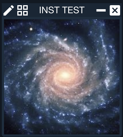
IMAGEVIEWER
Display a base64 image from a TLM packet
| Parameter | Description | Required |
|---|---|---|
| Target name | The target name | True |
| Packet name | The packet name | True |
| Item name | The item name to pull the CONVERTED value from. If additional processing (base64 encoding) is needed consider using a DERIVED item. | True |
| Format | The image format of the base64 data (e.g. jpg, png, etc) | True |
Example Usage:
IMAGEVIEWER INST IMAGE IMAGE jpg
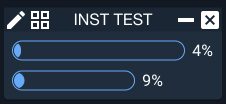
PROGRESSBAR
Displays a progress bar that is useful for displaying percentages
| Parameter | Description | Required |
|---|---|---|
| Target name | The target name | True |
| Packet name | The packet name | True |
| Item name | The item name | True |
| Scale factor | Value to multiple the telemetry item by before displaying the in the progress bar. Final value should be in the range of 0 to 100. Default is 1.0. | False |
| Width | Width of the progress bar (default = 100 pixels) | False |
| Value type | The type of the value to display. Default is CONVERTED. Valid Values: RAW, CONVERTED, FORMATTED | False |
Example Usage:
PROGRESSBAR INST ADCS POSPROGRESS 0.5 200
PROGRESSBAR INST ADCS POSPROGRESS
RANGEBAR
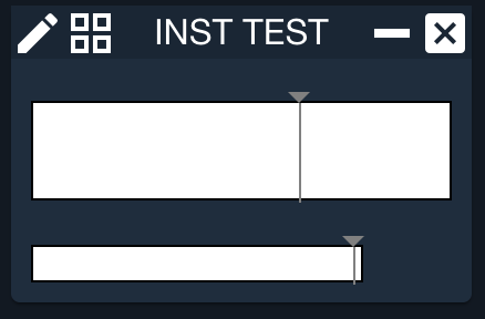
Displays a custom range bar displaying the item value
| Parameter | Description | Required |
|---|---|---|
| Target name | The target name | True |
| Packet name | The packet name | True |
| Item name | The item name | True |
| Low Value | Minimum value to display on the range bar. If the telemetry item goes below this value the bar is “pegged” on the low end. | True |
| High Value | Maximum value to display on the range bar. If the telemetry item goes above this value the bar is “pegged” on the high end. | True |
| Value type | The type of the value to display. Default is CONVERTED. Valid Values: RAW, CONVERTED, FORMATTED | False |
| Width | Width of the range bar (default = 100) | False |
| Height | Height of the range bar (default = 25) | False |
Example Usage:
RANGEBAR INST HEALTH_STATUS TEMP1 0 100000 RAW 200 50
RANGEBAR INST HEALTH_STATUS TEMP1 -100 100
ROLLUP
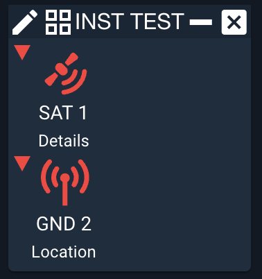
Since 5.17.1Displays a notification icon which changes color based on a rollup telemetry
| Parameter | Description | Required |
|---|---|---|
| Icon name | The astro UX icon to display. Valid choices are 'astro' icons taken from https://github.com/RocketCommunicationsInc/astro-components/blob/master/static/json/rux-icons.json. | True |
| Icon label | Text to apply to the icon label | False |
| Icon sublabel | Text to apply to the icon sublabel | False |
Example Usage:
ROLLUP satellite-transmit "SAT 1" "Details"
  # Screen to open on click
  SETTING SCREEN INST HS
  # Telemetry items to rollup status
  SETTING TLM INST HEALTH_STATUS TEMP1
  SETTING TLM INST HEALTH_STATUS TEMP2
ROLLUP antenna "GND 2" "Location"
  # Screen to open on click
  SETTING SCREEN INST HS
  # Telemetry items to rollup status
  SETTING TLM INST HEALTH_STATUS TEMP3
  SETTING TLM INST HEALTH_STATUS TEMP4
SIGNAL
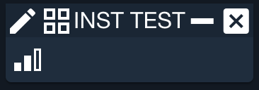
Since 5.17.2Displays a cellular signal icon which changes based on telemetry value
| Parameter | Description | Required |
|---|---|---|
| Target name | The target name | True |
| Packet name | The packet name | True |
| Item name | The item name | True |
| Value type | The type of the value to display. Default is CONVERTED. Valid Values: RAW, CONVERTED | False |
Example Usage:
SIGNAL INST HEALTH_STATUS TEMP1
  # Screen to open on click
  SETTING SCREEN INST HS
  # Values to compare when setting the 1-bar, 2-bar and 3-bar icons
  # Default is 30, 60, 90 (e.g. 0 to 100 range)
  # Value < -50 display no bars
  # Value >= -50 and < 0 displays 1 bar
  # Value >= 0 and < 50 displays 2 bars
  # Value >= 50 displays 5 bars
  SETTING RANGE -50 0 50
TEXTBOX
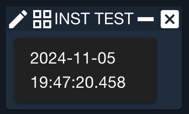
Provides a large box for multiline text
| Parameter | Description | Required |
|---|---|---|
| Target name | The target name | True |
| Packet name | The packet name | True |
| Item name | The item name | True |
| Width | Width of the textbox in px (default = 200) | False |
| Height | Height of the textbox in px (default = 200) | False |
Example Usage:
TEXTBOX INST HEALTH_STATUS PACKET_TIMEFORMATTED 150 70
VALUE
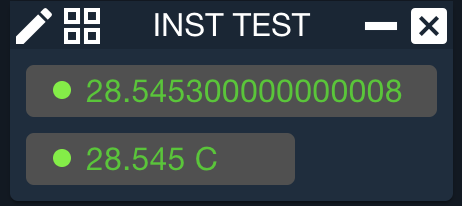
Displays a box with a telemetry item value
The white portion of the box darkens to gray while the value remains stagnant, then brightens to white each time the value changes. Additionally the value is colored based on the items limits state (Red for example if it is out of limits).
| Parameter | Description | Required |
|---|---|---|
| Target name | The target name | True |
| Packet name | The packet name | True |
| Item name | The item name | True |
| Value type | The type of the value to display. Default is CONVERTED. Valid Values: RAW, CONVERTED, FORMATTED | False |
| Number of characters | The number of characters wide to make the value box (default = 12) | False |
Example Usage:
VALUE INST HEALTH_STATUS TEMP1 CONVERTED 18
VALUE INST HEALTH_STATUS TEMP1
Interactive Widgets
Interactive widgets are used to gather input from the user. Unlike all other widgets, which only output some graphical representation, interactive widgets permit input either from the keyboard or mouse.
BUTTON
Displays a rectangular clickable button
Upon clicking, the button executes the Javascript code assigned. Buttons
can be used to send commands and perform other tasks. If you want your button
to use values from other widgets, define them as named widgets and read their
values using the screen.getNamedWidget("WIDGET_NAME").text() method.
See the example in CHECKBUTTON.
Button code can get rather complex so remember to use string concatenation
to make things more readable. If you use + newlines are inserted automatically
during string concatenation. If you use \ you'll need to separate lines with a
single semicolon ;. COSMOS uses double semicolon ;; to indicate lines should
be evaluated separately. Note that all OpenC3 commands (using api.cmd) must be
separated by ;;.
You can send commands with buttons using api.cmd(). The cmd() syntax looks exactly like the standard COSMOS scripting syntax. You can also request and use telemetry in screens using Javascript Promises.
api.tlm('INST PARAMS VALUE3', 'RAW').then(dur => api.cmd('INST COLLECT with TYPE NORMAL, DURATION '+dur))"
The api.tlm() function returns a Promise which is resolved with then() at which point we send the command with the telemetry value we received.
Scripts can be launched from a BUTTON using the runScript() method. runScript() takes three parameters,
the name of the script, whether to open the script in the foreground of Script Runner (default = true), and a hash of
environment variables. For example: runScript('INST/procedures/script.rb', false, {'VAR': 'VALUE'})
| Parameter | Description | Required |
|---|---|---|
| Button Text | Text displayed on the button | True |
| Button Code | Javascript code to execute when the button is pressed | True |
Example Usage:
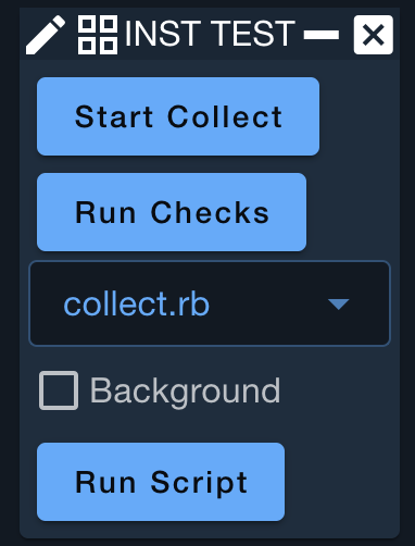
BUTTON 'Start Collect' 'api.cmd("INST COLLECT with TYPE NORMAL, DURATION 5")'
BUTTON 'Run Checks' 'runScript("INST/procedures/checks.rb")'
# More complex example with background checkbox and env vars
NAMED_WIDGET SCRIPTNAME COMBOBOX collect.rb checks.rb
NAMED_WIDGET BG CHECKBUTTON 'Background'
BUTTON 'Run Script' "var script=screen.getNamedWidget('SCRIPTNAME').text();" \
  # Set an environment variable to be used by the script as ENV['TYPE']
  "var env = {}; env['TYPE'] = 'TEST';" \
  "runScript('INST/procedures/'+script, !screen.getNamedWidget('BG').checked(), env)"
CHECKBUTTON
Displays a check box
Note this is of limited use by itself and is primarily used in conjunction with NAMED_WIDGET.
| Parameter | Description | Required |
|---|---|---|
| Checkbox Text | Text displayed next to the checkbox | True |
| Checked | Whether the initial state of the checkbox is checked (default = false). Do not give a value to make the checkbox unchecked. | False |
Example Usage:
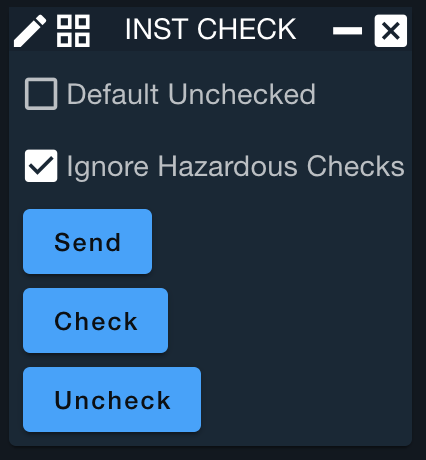
NAMED_WIDGET UNCHECKED CHECKBUTTON 'Default Unchecked'
NAMED_WIDGET CHECK CHECKBUTTON 'Ignore Hazardous Checks' CHECKED
BUTTON 'Send' 'screen.getNamedWidget("CHECK").checked() ? ' \
  'api.cmd_no_hazardous_check("INST CLEAR") : api.cmd("INST CLEAR")'
# You can programmatically check or uncheck the checkbox
BUTTON 'Check' 'screen.getNamedWidget("CHECK").value = true'
BUTTON 'Uncheck' 'screen.getNamedWidget("CHECK").value = false'
COMBOBOX
Displays a drop down list of text items
Note this is of limited use by itself and is primarily used in conjunction with NAMED_WIDGET.
| Parameter | Description | Required |
|---|---|---|
| Option Text 1 | Text to display in the selection drop down | True |
| Option Text n | Text to display in the selection drop down | False |
Example Usage:
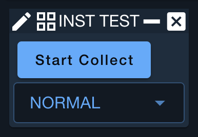
BUTTON 'Start Collect' 'var type = screen.getNamedWidget("COLLECT_TYPE").text();' +
  'api.cmd("INST COLLECT with TYPE "+type+", DURATION 10.0")'
NAMED_WIDGET COLLECT_TYPE COMBOBOX NORMAL SPECIAL
DATE
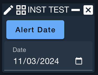
Displays a date picker
Note this is of limited use by itself and is primarily used in conjunction with NAMED_WIDGET.
| Parameter | Description | Required |
|---|---|---|
| Date label | Text to label the data selection ('Date' by default) | False |
Example Usage:
BUTTON 'Alert Date' 'var date = screen.getNamedWidget("DATE").text();' +
  'alert("Date:"+date)'
NAMED_WIDGET DATE DATE
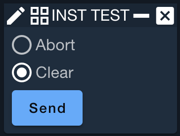
RADIOGROUP
Creates a group of RADIOBUTTONs
RADIOBUTTONs must be part of a group to enable selection logic
| Parameter | Description | Required |
|---|---|---|
| Initial selected button | Selects a radio button at initialization (0-based) | False |
RADIOBUTTON
Displays a radio button and text
Note this is of limited use by itself and is primarily used in conjunction with NAMED_WIDGET. It must be contained by a RADIOGROUP to enable typical selection of a single RADIOBUTTON.
| Parameter | Description | Required |
|---|---|---|
| Text | Text to display next to the radio button | True |
Example Usage:
NAMED_WIDGET GROUP RADIOGROUP 1 # Select 'Clear' initially, 0-based index
  RADIOBUTTON 'Abort'
  RADIOBUTTON 'Clear'
END
BUTTON 'Send' "screen.getNamedWidget('GROUP').selected() === 0 ? " +
  "api.cmd('INST ABORT') : api.cmd('INST CLEAR')"
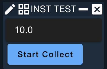
TEXTFIELD
Displays a rectangular box where the user can enter text
| Parameter | Description | Required |
|---|---|---|
| Characters | Width of the text field in characters (default = 12) | False |
| Text | Default text to put in the text field (default is blank) | False |
Example Usage:
NAMED_WIDGET DURATION TEXTFIELD 12 "10.0"
BUTTON 'Start Collect' 'var dur = screen.getNamedWidget("DURATION").text();' +
      'api.cmd("INST COLLECT with TYPE NORMAL, DURATION "+dur+"")'
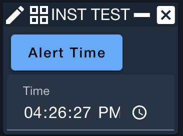
TIME
Displays a time picker
Note this is of limited use by itself and is primarily used in conjunction with NAMED_WIDGET.
| Parameter | Description | Required |
|---|---|---|
| Time label | Text to label the time selection ('Time' by default) | False |
Example Usage:
BUTTON 'Alert Time' 'var time = screen.getNamedWidget("TIME").text();' +
  'alert("Time:"+time)'
NAMED_WIDGET TIME TIME
Canvas Widgets
Canvas Widgets are used to draw custom displays into telemetry screens. The canvas coordinate frame places (0,0) in the upper-left corner of the canvas.
CANVAS
Layout widget for the other canvas widgets
All canvas widgets must be enclosed within a CANVAS widget.
The canvas coordinate frame places (0,0) in the upper-left corner of the canvas.
| Parameter | Description | Required |
|---|---|---|
| Width | Width of the canvas | True |
| Height | Height of the canvas | True |
CANVASLABEL
Draws text onto the canvas
| Parameter | Description | Required |
|---|---|---|
| X Position | X position of the upper-left corner of the text on the canvas | True |
| Y Position | Y position of the upper-left corner of the text on the canvas | True |
| Text | Text to draw onto the canvas | True |
| Font Size | Font size of the text (Default = 12) | False |
| Color | Color of the text | False |
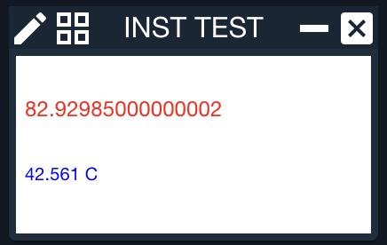
Example Usage:
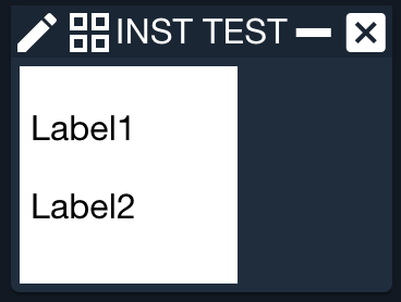
CANVAS 100 100
  CANVASLABEL 5 34 "Label1" 24 red
  CANVASLABEL 5 70 "Label2" 18 blue
END
CANVASLABELVALUE
Draws the text value of a telemetry item onto the canvas in an optional frame
| Parameter | Description | Required |
|---|---|---|
| Target name | The target name | True |
| Packet name | The packet name | True |
| Item name | The item name | True |
| X Position | X position of the upper-left corner of the text on the canvas | True |
| Y Position | Y position of the upper-left corner of the text on the canvas | True |
| Font Size | Font size of the text (Default = 12) | False |
| Color | Color of the text | False |
| Value type | The type of the value to display. Default is CONVERTED. Valid Values: RAW, CONVERTED, FORMATTED | False |
Example Usage:
CANVAS 200 100
  CANVASLABELVALUE INST HEALTH_STATUS TEMP1 5 34 12 red
  CANVASLABELVALUE INST HEALTH_STATUS TEMP2 5 70 10 blue FORMATTED
END
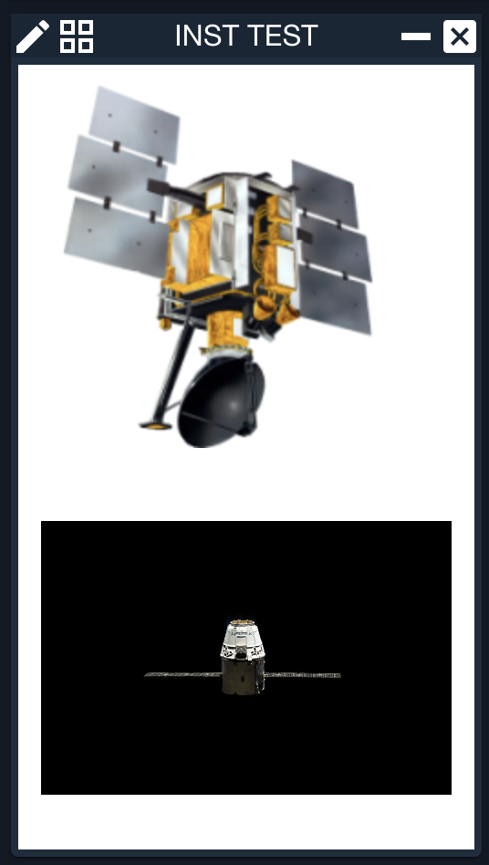
CANVASIMAGE
Displays an image on the canvas
| Parameter | Description | Required |
|---|---|---|
| Image filename | Name of a image file. The file must be in the plugin's targets/TARGET/public directory. | True |
| X Position | X position of the upper-left corner of the image on the canvas | True |
| Y Position | Y position of the upper-left corner of the image on the canvas | True |
Example Usage:
CANVAS 250 430
  CANVASIMAGE "satellite.png" 10 10 200 200
    SETTING SCREEN INST HS
  CANVASIMAGE "https://images.pexels.com/photos/256152/pexels-photo-256152.jpeg?auto=compress&cs=tinysrgb&dpr=2&h=640&w=426" 0 250 250 150
END
The following settings apply to CANVASIMAGE. They are applied using the SETTING keyword.
SCREEN
Open another screen when clicked
| Parameter | Description | Required |
|---|---|---|
| Target name | Name of the target | True |
| Screen name | Name of the screen | True |
CANVASIMAGEVALUE
Displays an image on the canvas that changes with a telemetry value
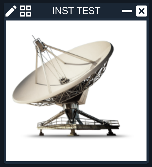
Use various SETTING values to indicate which images should be displayed based on telemetry. For example, SETTING IMAGE CONNECTED "ground_on.png" 400 100. See the DEMO for a complete example.
| Parameter | Description | Required |
|---|---|---|
| Target name | The target name | True |
| Packet name | The packet name | True |
| Item name | The item name | True |
| Value type | The type of the value to display Valid Values: RAW, CONVERTED, FORMATTED | True |
| Default image filename | The default image to display. The file must be in the targets/TARGET/public directory. | True |
| X Position | X position of the upper-left corner of the image on the canvas | True |
| Y Position | Y position of the upper-left corner of the image on the canvas | True |
| Image width | Width of the image (default is 100%) | False |
| Image height | Height of the image (default is 100%) | False |
Example Usage:
CANVAS 230 230
  CANVASIMAGEVALUE INST HEALTH_STATUS GROUND1STATUS CONVERTED "ground_error.png" 10 10 180 180
    SETTING IMAGE CONNECTED "ground_on.png" 10 10
    SETTING IMAGE UNAVAILABLE "ground_off.png" 10 10
    SETTING SCREEN INST HS
END
The following settings apply to CANVASIMAGEVALUE. They are applied using the SETTING keyword.
IMAGE
Map an image to a state or value
| Parameter | Description | Required |
|---|---|---|
| Value | State or value | True |
| Image filename | Image to display. The file must be in the targets/TARGET/public directory. | True |
| X Position | X position of the upper-left corner of the image on the canvas | True |
| Y Position | Y position of the upper-left corner of the image on the canvas | True |
SCREEN
Open another screen when clicked
| Parameter | Description | Required |
|---|---|---|
| Target name | Name of the target | True |
| Screen name | Name of the screen | True |
CANVASLINE
Draws a line onto the canvas
| Parameter | Description | Required |
|---|---|---|
| Start X Position | X position of the start of the line on the canvas | True |
| Start Y Position | Y position of the start of the line on the canvas | True |
| End X Position | X position of the end of the line on the canvas | True |
| End Y Position | Y position of the end of the line on the canvas | True |
| Color | Color of the line | False |
| Width | Width of the line in pixels (default = 1) | False |
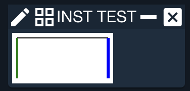
Example Usage:
CANVAS 100 50
  CANVASLINE 5 5 95 5
  CANVASLINE 5 5 5 45 green 2
  CANVASLINE 95 5 95 45 blue 3
END
CANVASLINEVALUE
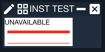
Draws a color changing line onto the canvas
The line is represented by one of two colors based on the value of the associated telemetry item
| Parameter | Description | Required |
|---|---|---|
| Target name | The target name | True |
| Packet name | The packet name | True |
| Item name | The item name | True |
| Start X Position | X position of the start of the line on the canvas | True |
| Start Y Position | Y position of the start of the line on the canvas | True |
| End X Position | X position of the end of the line on the canvas | True |
| End Y Position | Y position of the end of the line on the canvas | True |
| Width | Width of the line in pixels (default = 3) | False |
| Value type | The type of the value to display. Default is CONVERTED Valid Values: RAW, CONVERTED, FORMATTED | False |
Example Usage:
CANVAS 120 50
  CANVASLABELVALUE INST HEALTH_STATUS GROUND1STATUS 0 12 12 black
  CANVASLINEVALUE INST HEALTH_STATUS GROUND1STATUS 5 25 115 25 5 RAW
    SETTING VALUE_EQ 1 GREEN
    SETTING VALUE_EQ 0 RED
  CANVASLINEVALUE INST HEALTH_STATUS GROUND1STATUS 5 45 115 45
    SETTING VALUE_EQ CONNECTED GREEN
    SETTING VALUE_EQ UNAVAILABLE RED
END
The following settings apply to CANVASLINEVALUE. They are applied using the SETTING keyword.
VALUE_EQ
Since 5.5.1Map a value to a color
| Parameter | Description | Required |
|---|---|---|
| Value | State or value | True |
| Color | Color of the line | True |
CANVASDOT
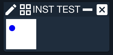
Draws a dot onto the canvas
| Parameter | Description | Required |
|---|---|---|
| X Position | X position of the dot | True |
| Y Position | Y position of the dot | True |
| Color | Color of the dot | True |
| Radius | Radius of the dot in pixels | True |
Example Usage:
CANVAS 50 50
  CANVASDOT 10 15 BLUE 5
END
Example File
Example File: TARGET/myscreen.txt
SCREEN AUTO AUTO 0.5
VERTICAL
  TITLE "<%= target_name %> Commanding Examples"
  LABELVALUE INST HEALTH_STATUS COLLECTS
  LABELVALUE INST HEALTH_STATUS COLLECT_TYPE
  LABELVALUE INST HEALTH_STATUS DURATION
  VERTICALBOX "Send Collect Command:"
    HORIZONTAL
      LABEL "Type: "
      NAMED_WIDGET COLLECT_TYPE COMBOBOX NORMAL SPECIAL
    END
    HORIZONTAL
      LABEL "  Duration: "
      NAMED_WIDGET DURATION TEXTFIELD 12 "10.0"
    END
    BUTTON 'Start Collect' "api.cmd('INST COLLECT with TYPE '+screen.getNamedWidget('COLLECT_TYPE').text()+', DURATION '+screen.getNamedWidget('DURATION').text())"
  END
  SETTING BACKCOLOR 163 185 163
  VERTICALBOX "Parameter-less Commands:"
    NAMED_WIDGET GROUP RADIOGROUP 1 # Select 'Clear' initially, 0-based index
      RADIOBUTTON 'Abort'
      RADIOBUTTON 'Clear'
    END
    NAMED_WIDGET CHECK CHECKBUTTON 'Ignore Hazardous Checks' # No option is by default UNCHECKED
    BUTTON 'Send' "screen.getNamedWidget('GROUP').selected() === 0 ? api.cmd('INST ABORT') : (screen.getNamedWidget('CHECK').checked() ? api.cmd_no_hazardous_check('INST CLEAR') : api.cmd('INST CLEAR'))"
  END
  SETTING BACKCOLOR 163 185 163
END